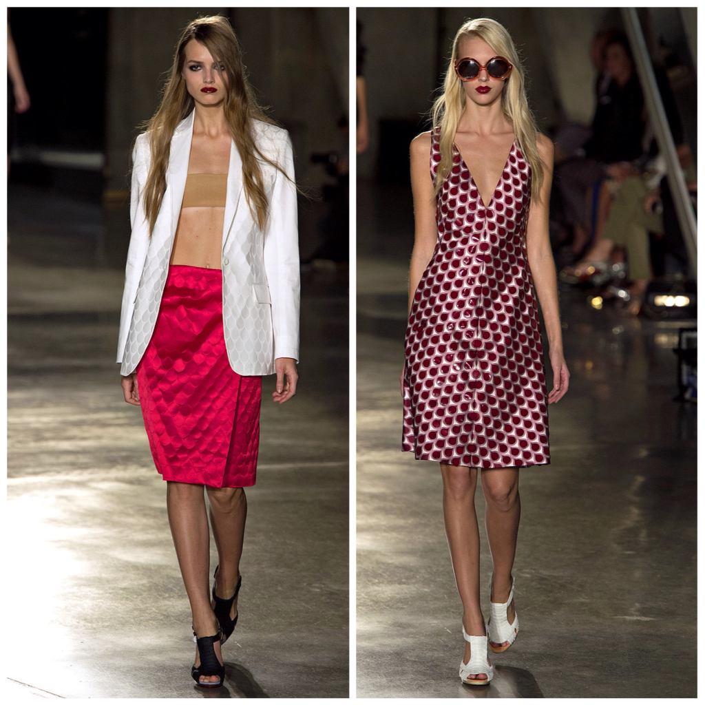
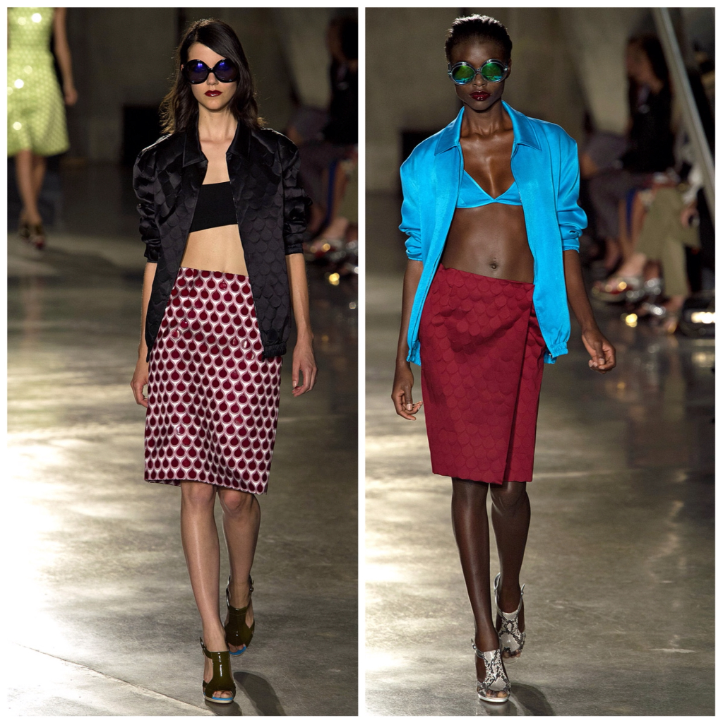
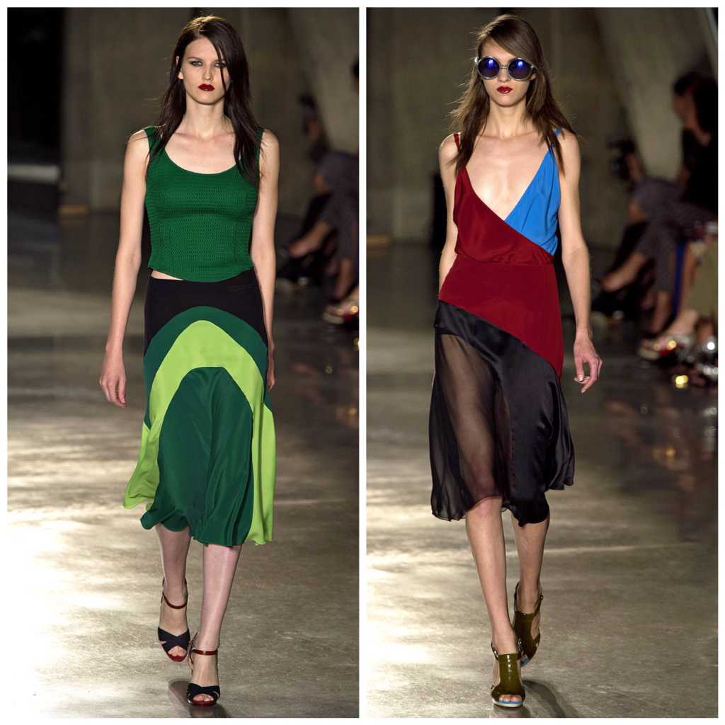
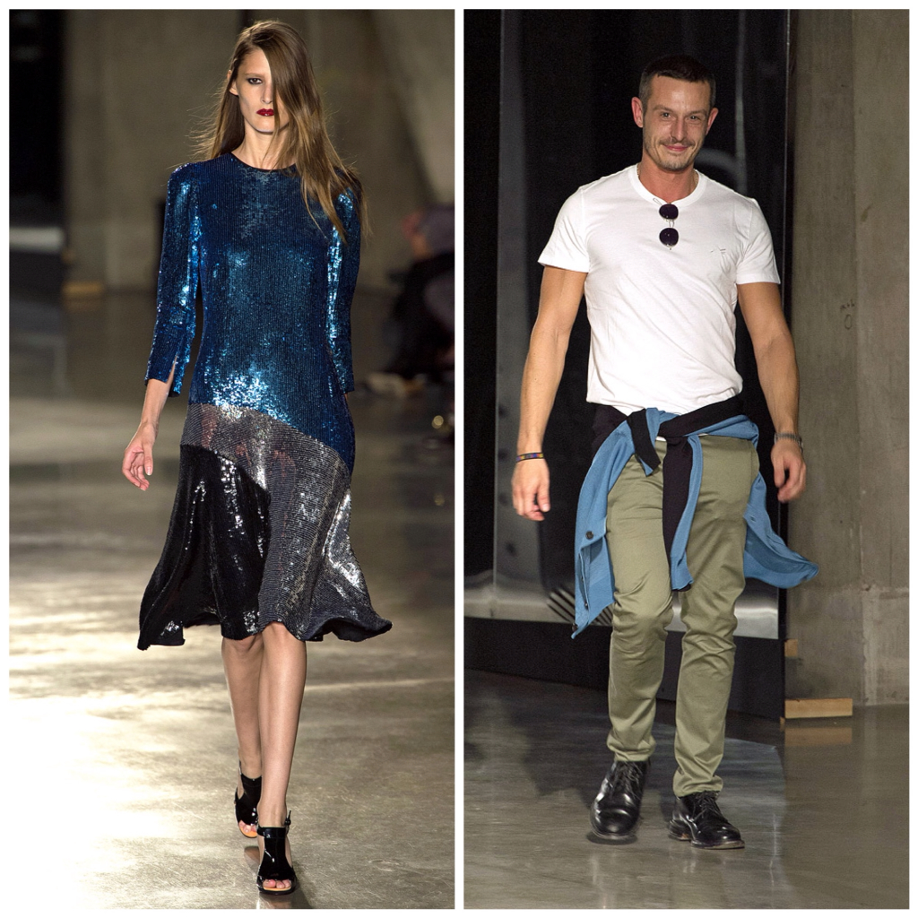
Then came those raindrop-effect separates (it looked like more than just print in the beginning, and was then just that later on) and my heart melted. They were new, fresh, wearable!
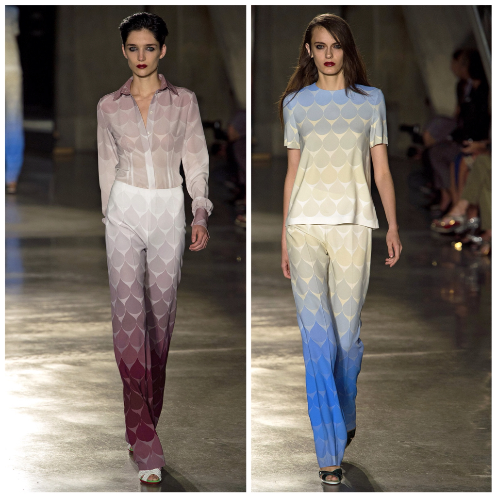
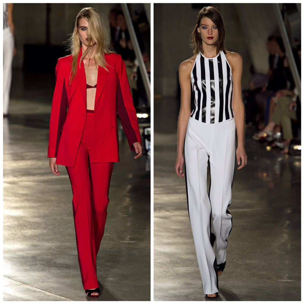
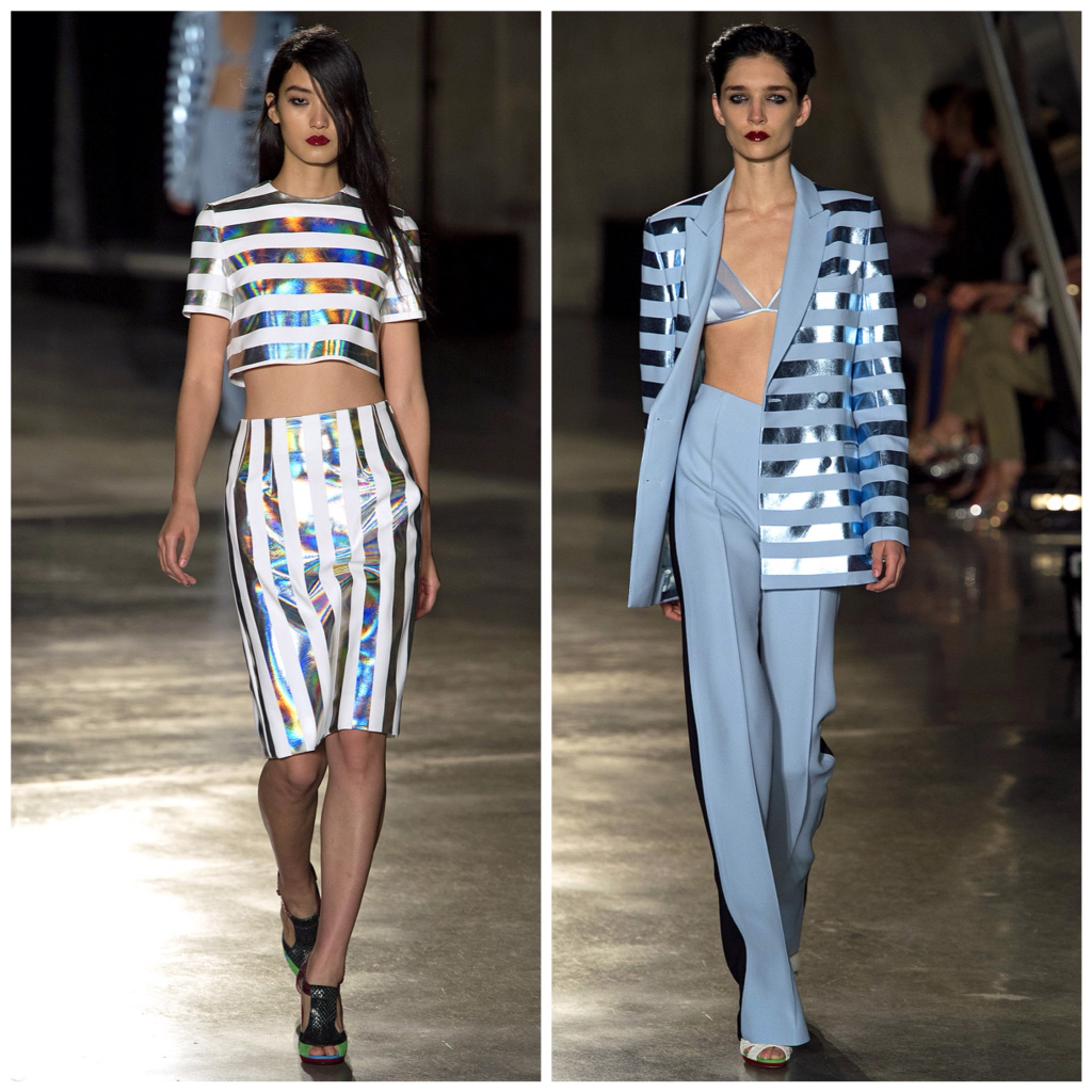
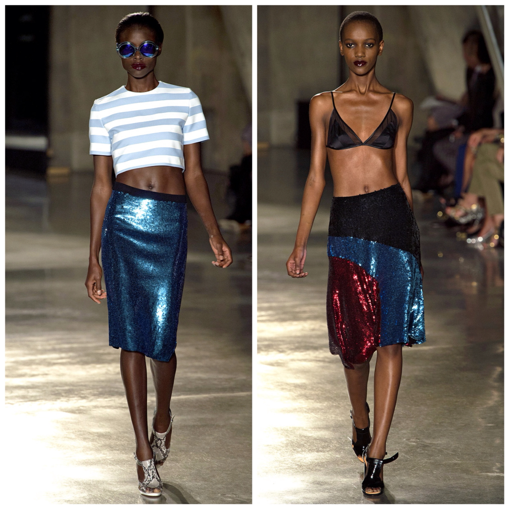
By the time the stripes started happening, I was completely into the swing of things. They came from a similar mental place as Marc Jacobs, but had a more glam feel with the metallics and sequins. It was sport glam the Saunders way, and of course it worked wonderfully.
Just a side note: you can imagine Saunder's panic when he saw the images from Marc Jacobs and realised they were doing pretty much the same thing. It pushed him to make the necessary changes which resulted in, in my opinion, something better!


No comments:
Post a Comment